New at WonkComms: Finding Home

I’ve a new post up this week at WonkComms, talking about how our team at The Century Foundation put together our first digitally-native report. Here’s a taste:

Disclaimer: there’s nothing inherently wrong with PDFs. They work on pretty much any device, and for printing, they’re tough to beat.

But PDFs on the web are a hack. They’re born of the web’s early days when putting something online meant hardcoding in HTML. Instead of adapting content to what was then a pretty limited visual experience, we #wonkcomms types opted to produce electronic versions of print documents to post online.

Unfortunately, as the web improved, our processes didn’t. We continued to make the PDF report our central product. Most wonkcommers make noises about moving beyond the PDF, opting for blog posts, infographics, and BuzzFeed listicles. But many others continue to treat the PDF report as the “real” product.

Admittedly, our team at The Century Foundation hasn’t figured out exactly how to move beyond the PDF. But we are trying some new things. In fact, our first entry into digitally-native reportslaunched on March 10.

This post walks you through our process in producing the piece. (Note: it will make more sense if you see the end product first. Go ahead and take a look. We’ll wait.)

Read the full thing at WonkComms.

Skeuomorphism, or Digital Content Needs Better Metaphors

I’m not a designer by training. In fact, I am not a designer at all. My extraordinarily talented brother was blessed with all the artistic ability. I’m a writer-turned-content strategist who dabbles in design because my agency lacks the budget for a full-time designer. All of this is basically a long-winded way of building up to the admission that in my scrambling around to play amateur designer, I frequently come across concepts that are assuredly quite familiar to trained designers, but that are new to me.

So when I read about skeuomorphic design, it was a bit of a revelation. I suppose that on some level I recognized a skeuomorph, which Wikipedia tells me is “a derivative object that retains ornamental design cues to a structure that was necessary in the original.” I see these things all the time—the page-flipping animation in iBooks, fake spokes on the hubcaps of cars, the veneer my keyboard is currently resting on. But now I had a name for the concept.

I was particularly struck by skeuomorphic design because it resonated with something I’d been pondering already. An academic acquaintance recently asked his Facebook friends for the best way to organize the various PDFs of journal articles he keeps on his local machine. My friend’s issue: he wanted to be able to save the same file under multiple topics without also having to create multiple copies of the files.

This seems like it should be a simple matter. But it’s surprisingly complicated, typically requiring the download of some sort of software package that one must then learn to use.

It reminded me of a thought to which I keep coming back: We need a better metaphor for our online world.

The Filing Cabinet

People have been writing things down for…well, for a long time. And pretty early on, it occurred to folks that writing things things down was useful both for passing information along and for recording information you didn’t want to forget. Of course, that last one meant that once you wrote something down, you needed to be able to find it again. And that’s why the person who invented paper invented the filing cabinet a few days later. (Note: I’ve no idea if that’s true. But if it’s not, it should be.)

So for a lot of years, knowledge workers had to know two things: What to write down and how to organize whatever they wrote down.

Fast forward to the 1980s and the dawn of the personal computer age. “Writing” began to consist of pushing keys to create terribly complex sets of 0s and 1s on a magnetic storage device. Writers with PCs needed to know what to write down and how to tell the computer which set of 0s and 1s to retrieve.

So some really smart people decided that to make things easier, we’d just use a metaphor that everyone already understood. We could call each complete set of 0s and 1s a file. These files could be represented by an image of a piece of paper. To complete the metaphor, we could put those pictures of paper into little pictures of folders. Users could name the files and the folders exactly like they organized the pieces of paper that they used to create.

In short, we built a cool new technology and then immediately saddled it with a 1000+ year old metaphor.

Why It’s Time to Ditch the Metaphor

As a general rule, I’m a big fan of metaphors. This probably comes from my time as an academic philosopher. Philosophers deal with a lot of abstractions. Great philosophers are able to grapple with the abstractions directly. The rest of us tried to sneak up on the abstractions through analogies, metaphors, and thought experiments. Those of us who are (or were, in my case) primarily philosophy teachers spent a lot of time trying to craft metaphors that got at the complexities of the abstraction but could still be grasped by sleepy freshmen.

Metaphors are a great way of helping us to understand new concepts by way of familiar constructs. But metaphors also run the risk of obscuring important differences.

I think this is especially true of the digital world. Files and folders helped to make a new technology more acceptable by making the computer an extension of things that were already familiar to the business world. But that same metaphor also limited our use of the computer by saddling digital files with all the limitations of their physical brethren. The most notable of these:

Physical files can only be in once place at a time.

Digital files aren’t like that. The physical location of all the 0s and 1s that make up a file is completely independent of the visual metaphor we use in constructing our UI. It’s possible to create dozens of different taxonomies that point to a single set of content. There’s no conceptual reason for continuing to use a digital filing cabinet metaphor that limits us to a single navigational structure.

The Internet has started to move away from the filing cabinet metaphor. Tagging and folksonomies allow for multiple paths to content on a website. APIs hold out the promise of multiple apps with distinct UIs for any given body of content.

The enterprise is starting to learn from the web. At CBO, we’re using SharePoint 2010 internally. SharePoint’s document libraries can be used as traditional shared storage, but they also hold out the possibility of a radical break from the traditional model. A few early adopters here have experimented with SharePoint’s metadata capabilities. There are projects that consist of a single document library and documents that are tagged in 10 different ways, allowing collaborators to filter on multiple dimensions.

That model is still the exception, though. Most of our users still insist on a single hierarchy, and a lot of our SharePoint users deploy folders in their libraries. (Note to Microsoft: Please, please kill off folders in the next iteration of SharePoint. Their very existence makes it too hard for ordinary end users to shift to your new metaphor.) Files and folders are familiar—especially in an enterprise setting, and even more especially in a world in which there are still many decision-makers who began their careers using typewriters and carbon paper.

Weaning people away from the digital filing cabinet will take some time. It will be even harder if we’re leading them into a world that isn’t based on a familiar metaphor. I wish I had a replacement to suggest. Unfortunately, diagnosing a problem is always easier than solving it. Here’s hoping that some real designers can offer a solution. If we’re really lucky, it might carry us through the next 30 or so years of our new digital world.

The Girl With the Dragon Tattoo, or Your Website Is Not a Used Bookstore

Imagine taking a good-sized bookstore, picking it up, and shaking its contents out onto a football field. Somewhere in the resulting pile of books lie the works of Aristotle, Newton, and Auden, but if you wade in and start picking up books at random, you’re much likelier to get Love’s Tender Fury and Chicken Soup for the Hoosier Soul. We’re so used to the way a bookstore is laid out that we don’t notice how much prior knowledge we need to have about its layout and categories for it to be even minimally useful.

– Clay Shirky, Here Comes Everybody

My favorite bookstore in the world (sadly now closed) was built inside an old Carnegie library in Parkersburg, WV. The summer before my senior year of college, I had an internship in the business right next door to Trans Allegheny Books. The very best part of that internship was spending lunch breaks browsing through the dusty collections of used books.

Trans Allegheny Bookstore
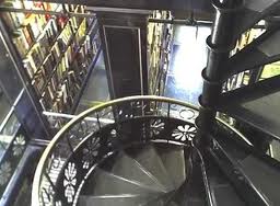
A first-time visitor might not have appreciated the collection. Indeed, most visitors came for the wrought-iron spiral staircase that wound its way through three stories of glass-floored stacks. The casual visitor could find great bargains on the mid-century-vintage hardcover fiction and non-fiction resting on original, turn-of-the-century shelving. Dedicated bibliophiles might venture away from the stacks into the third floor room that held late 19th-century copies of classic novels. Only the really dedicated browser would notice that paperback fiction resided in much-less-glamorous basement. Those who loitered by the checkout might also notice the first editions and more-than-a-century-old books in the locked barrister cases.

My Trans Allegheny collection includes dozens of paperback SF novels, a first-edition of one of Charles Dickens’ more obscure books (a graduation gift from my brother), and a ratty copy of David Hume’s five-volume History of England that I dug out of a box in the corner of an upstairs room whose dust was thick enough that I could see my footprints.

I spent enough time in Trans Allegheny to learn my way around its unorthodox organization. There was a method to the apparent madness—one that became apparent to anyone willing to spend a bit of time exploring and a bit of energy deciphering the patterns. A couple of conversations with the owner (who was frequently the only salesperson) confirmed my observations. It was an arrangement that made perfect sense to the owner: the least profitable stuff goes in the basement, the stuff with good profit margins goes in the heavily-trafficked area, the obscure harder-to-sell stuff goes where only the bibliophiles go, and the really valuable stuff stays where he could keep an eye on it.

If your use-case is: I want to maximize my profits selling books, then this was a perfectly sensible arrangement. It was also a pretty good arrangement if your use-case was: I want to spend an hour poking around a used bookstore and maybe uncover a hidden treasure. If your use-case was: I want to see every book you have by Charles Dickens, it was a less useful arrangement. Trans-Allegheny was built on the assumption that most of its customers were not in that last category.

Used bookstores—especially those housed in uniquely-lovely historic buildings—can afford the luxury of an idiosyncratic information architecture. Casual browsers just need to be able to find the Chicken Soup section. Regulars are there because they like being there. They’re not just willing to spend the time learning their way around. Most of them actively enjoy poking through the boxes in the corner, never knowing what they might find around the next bend.

Websites can’t.

Stakeholders are often too willing to assume that since a particular organization makes sense to them, it will also make sense to their users. Too often they say things like, “Our really important clients care about what we do, and they’ll either understand or take the time to understand why we’ve organized the way we have.”

But website visitors aren’t really like patrons of used bookstores. Indeed, the runaway success of Amazon (and the corresponding decline of used bookstores like Trans Allegheny) seems to provide pretty reliable evidence that the majority of book-buyers aren’t like patrons of used bookstores. They much prefer the See everything by Charles Dickens arrangement. The big brick-and-mortar bookshops have all recognized this basic fact. One Barnes and Noble looks pretty much exactly like the next. And, frankly, if you swap out a few signs, you could convert a Barnes and Noble into a Waterstone’s without much trouble. That uniformity is what allows everyone and her brother to find a copy of The Girl With the Dragon Tattoo.

We’d like to think that all our visitors are really interested in first editions of obscure Dickens’ works. But in fact, they are (mostly) uninterested in exploring the dusty corners of our websites for undiscovered gems. They just want The Girl With the Dragon Tattoo and they want it now. If you don’t have it out in plain sight, someone else will. And the next website is just a few keystrokes away.

If we insist on an information architecture that forces our users to become used-bookstore junkies, then we run a very real risk of going the way of Trans Allegheny.

Your CMS Sucks. Here’s Why That Matters.

My last post diagnosed some of the problems that can get in the way of good content strategy. I argue there that one of the main culprits is a lousy content management system, which leads to:

  • Content that isn’t adaptable across platforms.
  • Processes still driven by the needs of print.
  • Enterprise content management systems geared toward facilitating the sharing of documents.
  • Online CMSes that are uniformly hard to use.

There are no one-size-fits-all answers to the problem. But last week’s An Event Apart conference helped to point me in the right direction. I remarked at the time that there seemed to be a nice convergence between Kristina Halvorson’s advice to add page tables to content strategy and Karen McGrane’s call for a better-designed CMS. Having had a few days to process, I’m even more certain that there’s some real there there. First a bit of context.

Page Tables: Wireframes for Content

Most designers are familiar with the concept of page templates, which are usually wireframes that show page layout and functional requirements. When it comes to content, though, page templates typically features variations on lorem ipsum. (Samuel L. Ipsum is my personal favorite.)

Halvorson encourages designers to add page tables to their documentation. As she explains them in Content Strategy for the Web:

The page table tells you everything you need to know about the content on a specific website page (or content module)—from the objective and source content to the content recommendations and their implications, including requirements for creation delivery, and maintenance.

Example Page Table

Page tables go beyond design. They tell the users precisely what content will appear in each part of the page. For those managing relatively small sites, there’s a page table for every page. Those managing larger sites (e-commerce or news sites, for example) will have a page table for each type of product—a template that explains exactly where each piece of content lives. A page table more than just a display of the different content areas on a page. It is a description of the actual content for each of those content areas.

(Note: Page table example is from Attention, Message, Action.)

Content Management: Write Chunks, not Blobs

For many organizations, simply having some page tables would be an improvement. The real power of a page table, though, lies in the way that they can inform our content management systems.

McGrane’s AEA presentation discussed the case of NPR, and its philosophy of Create once, publish everywhere. NPR manages this feat by structuring its content. Authors write in chunks rather than in undifferentiated blobs. And that writing in chunks starts with a CMS that requires chunks rather than blobs. Check out the (blurry, but legible) peek into NPR’s content management system.

NPR's content management system

Isn’t that a thing of beauty? Authors creating structured data. That data is then fed into an API which in turns pumps delicious xml content to npr.org, to the iPhone app, to affiliate websites, to iTunes, to the NPR mobile site, and so forth. Because the content is media-agnostic, it’s ready to get ported into anything…including whatever that Next Big Thing turns out to be. 

From Content Strategy to Content Management

Here’s where the real power of page tables come in. All those lovely page tables that explain exactly what content goes in what section can be used to build content management systems that break our content into chunks.

In a nutshell, a content management system like NPR’s, when paired up with a robust set of page table templates, allows metadata to replace art direction. Content creators will no longer design documents. They will create content. The CMS will do the organizing for the content creators: Creators decide what things are important, put those things into the correct fields, and then let the template—not the CMS—arrange the display.

That does mean giving up on controlling how my content appears on the web. But, then, it’s not clear that we ever really had control over how our content appears online. With the advent of tools like Readability and Flipboard, we have even less than we used to.

We can’t control appearance. But we can control importance. Metadata allows us to prioritize content, and it allows us to communicate those priorities across platforms that we don’t control.

For any of this to work, those priorities have to be baked into the process. And that means building them into a CMS that your creators can actually use.

Beyond Lorem Ipsum. Rethinking Content Strategy.

Web design is about more than slapping a nice palette over top of a grid based on the golden ratio. Nor is it about using the latest CSS tricks (cool as those may be).

It’s about thinking of your entire site holistically. Sure, design matters. But so does content. And context. You can’t design a site without first figuring out the content. Or, as Jeffrey Zeldman put the point a few years ago:

Design in the absence of content is not design, it’s decoration.

(And who says you can’t have substance in 140 characters?)

Content management systems: The software that UX forgot

As someone who has spent the last two years preaching the gospel content first gospel, I wanted to stand and cheer throughout most of the two days of DC’s An Event Apart conference last week. Much of the conference revolved around content. (Well, technically, much of the conference revolved around adaptive design, but the running subtext was that adaptive design won’t help unless you have the right sorts of content inside your design.)

I’ve already touched a bit on day 1 of the conference. Now that I’ve had time to mull things over a bit, I’d like to offer what was (for me, anyway) the main lesson of the event. So here goes:

If your content sucks, there’s a good chance it’s because your content management system sucks.

And, frankly, your content management system probably sucks. Don’t feel bad. Pretty much all of them do. As Karen McGrane quipped, “Content management systems are the enterprise software that UX forgot.”

Let’s face it: there’s a reason that WordPress is crazy popular, and that reason certainly isn’t the technology. I mean, it’s slow, it’s full of hacked together plugins, and it’s a security nightmare. But it powers 1348392885790 blogs (approximately) because it’s Really. Simple. To. Use. In 10 minutes, I can set up my account and start blogging at WordPress.com. Even the self-hosted version requires very few technical skills to set up and maintain. Unless I’m a serious power user, I can do anything I want without ever leaving the admin interface. And once I’m in that interface, I can drag things around to accommodate my own workflow.

Contrast that with, say, Drupal, which is an extremely powerful CMS that is far more extensible, scales better, and is more secure than WordPress. But my god, is it ever unfriendly to content creators.

On an enterprise level, things are even worse. XML publishing systems are awkward, expensive, and rare. In fact, in many places, SharePoint is the closest thing to an ECMS you’ll find. But SharePoint is mostly good for managing Word documents. You need third-party applications to extract and reuse content from a Word doc. And even if you have all that in place, it’s not like SharePoint is all that user-friendly.

Create once. Publish in…multiple sizes of PDF.

So what do we end up with? Well, if you’re like my agency, then the combination of lousy content management systems and easy-to-use word processors with their nice wysiwyg editors (added to a set of senior managers who really prefer to read on paper) results in a publishing process that is geared entirely toward print. Word documents with their inline styling get circulated (by email, no less) and then moved into a print production process (using Framemaker, speaking of things that have been largely forgotten) and then handed off to the web team as PDF documents.

That’s not a process that lends itself toward producing even good HTML content. It’s certainly not a process that allows for a create once, publish everywhere approach. Right now, we’d need a full team for every medium — a print production team, a web production team, a mobile production team, an app production team…it’s tiring just thinking about it.

Alternatively, you can do as one person at my agency suggested and just have the print people create a 3-inch PDF for people to read on their BlackBerry.

So the situation thus far:

  • Content that isn’t adaptable across platforms.
  • Processes still driven by the needs of print.
  • Enterprise content management systems geared toward facilitating the sharing of documents.
  • Online CMSes that are uniformly hard to use.

The solution requires a fundamental rethinking of how we produce and organize content. But this post is already really long. So in the interests of trying to live by my own rules, I’ll save the solution for the next post.

That one will have pictures.

Print Is Dead, Metadata Rocks, and Grocery Store Tiles Are Different Sizes: Lessons from An Event Apart, Day 1

So I recognize that my title is obnoxiously long. I also recognize that I’m violating all the rules I spend my days championing. (Short titles. Most important sentence first. Action in the first 5 words. Keywords.)

I don’t really care.

This is my blog. About 8 other people read it. On a really good day. I can ramble if I wanna.

Okay, I feel better.

Anyway, I’m decompressing from day one of DC’s An Event Apart conference. The whole day was fantastic. But the parts that have (so far, anyway) really stuck with me were talks by Andy Budd and Karen McGrane.

Andy spoke about persuasive web design. A lot of what he discussed is stuff that real designers (aka, those who actually learned about design in some sort of formal setting) probably already know. Specifically, he talked a lot about the psychology of persuasion. There were lots of mentions of various cognitive biases and/or shortcuts that we humans are prone to making. You know, stuff like “halo effect” and “selection bias” and “loss aversion” and “operant conditioning.”

I quite like this sort of thing anyway, so it’s probably no surprise that I quite enjoyed the talk. In fact, some of the things that (I suspect) you get in Advertising 101 just hadn’t ever occurred to me. One illustrative example: Ever notice how supermarkets often change the flooring in their luxury goods aisle? You know, like the floor goes from tile to hardwood. Partly that’s just to signal that, Hey You’re In Fancy-Pants Land.

But there’s also a more subtle reason going on.

See, your shopping cart makes regular clickety-clacking sounds as you go across the tile. When you hit the hardwood, those clickety-clacks get faster (because of how hardwood is narrower than tiles and all.) So it sounds like you’re going faster. Which makes most of us slow down. It’s totally unconscious. But it works.

Pretty neat, huh.

Also, Andy totally looks like Joshua Gomez, so that kind of makes me like him. I’m pretty sure that’s some weird form of authority bias.

Toward the end of the day, Karen spent an hour chatting with us about adaptive content (aka, the idea that you create once, publish everywhere.)

I’m going to keep the recap here pretty brief, largely because I’m mulling over a much longer post on the topic in the coming days. Suffice it to say, though, that I spent much of Karen’s talk wanting to stand up and cheer. Her theme throughout the talk was a simple one:

Content must be separated from display.

It seems like an easy concept. Indeed, in principle, this is what content management systems were supposed to do. Only then we shoved WYSIWYG editors into our CMS. We used those to shove images and tables inline, then ended up with a whole pile of unstructured data than can’t easily be reused. And that’s if we were lucky. For a lot of publishers, print is still king, and we online types are trying to shoehorn print processes into an online world.

Karen offered a three-step strategy for moving our sites in the direction of adaptive content:

  1. Write for the chunk, not the page.
  2. Demystify metadata.
  3. Build a better CMS workflow.

Easy, right? Hey, wait, I have to give up my wysiwyg editor? WTF?

So those are the big takeaways for today. Tomorrow brings (among other things) Kristina Halvorson on content strategy and Whitney Hess on the philosophy of UX. Hey, look at me all excited about a conference on philosophy! It’s like I’m a starving academic again.

Newspapers and Universities

Are universities headed down the same path as newspapers? That’s the prediction Matt Yglesias offered a couple of days ago on his blog. Here’s Matt:

I was reading John Gravois on “The College For-Profits Should Fear” in the Washington Monthly and Paul Campos’ continuing jeremiads about legal education (and this) and I more and more have the feeling that American universities are headed for a newspaper-style, technologically-induced giant collapse at some point in the not-to-distant future.

Matt goes on to outline some similarities. News reporting can be done more efficiently via the Internet. Similarly, so can finding lots of facts about the world. The internet allows anyone with sufficient interest and talent to play the role of journalist. Ditto for teaching. The internet reduces the marginal cost of bringing news to an additional eyeball to zero. Ditto for a video lecture. And so on.

The comment section is filled with protestations of the “But a university education isn’t about communicating facts; it’s about teaching students how to think effectively. You can’t get that from reading Wikipedia!” sort. And that’s all true. But is that really so different from the “Newspapers provide objective and impartial filtering of facts. You can’t get that from bloggers” sort of claim that old media types make about the new media world that is fast replacing them? I’m not so sure.

Here’s my $0.02 on the matter, based solely on my own (admittedly brief and increasingly distant) stint as an academic.

Teaching is a skill. But by-and-large, it’s not a skill that graduate programs spend much time attempting to impart to graduate students. And at top universities, teaching is not a skill that gets much in the way of recognition. An increasingly crowded job market means that the only way to land a job (never mind getting tenure) is to publish, publish, publish. Even at my decidedly off-brand university, I maintained an article per semester, completed manuscript before tenure review pace.

I was lucky, though. My university still valued teaching; the individual recognized as the university’s outstanding teacher each year was the opening convocation speaker each fall. Rumor has it, though, that at some Name Brand Universities, getting a reputation as a great teacher can actually hinder one’s quest for tenure. Listening to my friends describe the professors at their large undergraduate universities leads me to think that there’s at least some truth to the rumor. (My own undergraduate experience was decidedly different, but then my largest intro class had only about 35 students in it.)

So where am I going with all of this?

The fact is that there are some really great teachers out there. And every once in a while, there is a really great teacher who is also one of the top researchers in her/his field. Once upon a time, classes with great teacher/researchers were limited to a relatively small group of students. But now there is really no reason why that needs to be true. Lectures can stream to millions of students simultaneously. Archives of those lectures can reach millions more. Students can write essays, post those essays on their blogs, and have their arguments evaluated by an army of motivated volunteers (“motivated volunteer” being more-or-less a synonym for “graduate student” anyway.)

All of this is a long-winded way of saying that the cost curve of a university education is unsustainable. And unsustainable trends are, well, unsustainable. At some point, prices for college education are going to crash, and when they do, a lot of local colleges and universities are going to find themselves going the way of local newspapers. Those that survive are going to be in one of two classes: Brand Name Universities that subsidize the traditional college experience for a select few by offering an online product to the masses, and Small Local Universities that eliminates everything that is not teaching classes.

Any of that sound familiar?